Redesign Direction — Cuteness and Feel as the Yardstick
If I had to pick just one criterion for the rebuild, it was "cute, and deliberately designed." The old version drifted into a horror tone because I started bolting on assets before ever nailing down the mood.
This time I pinned the mood down in writing first.
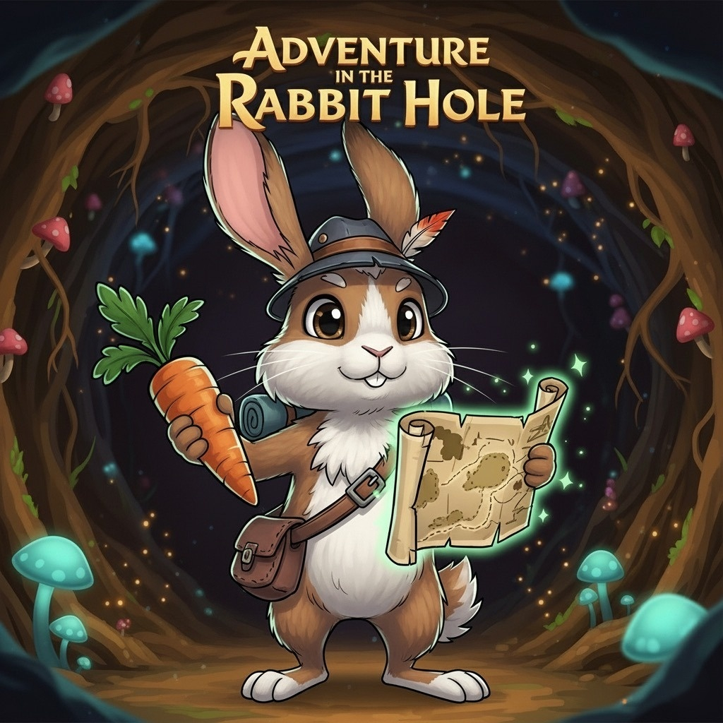
Write the mood down before anything else
I settled on the mood "cozy twilight burrow." A warm, calm storybook evening.
The dirt is warm milk chocolate (#8a5a3c), and the fog is a gradient melting from peach into deep amber.
My reference points for that sense of warmth were Alto's Adventure and Monument Valley.
Writing it down first makes later decisions fast.
Whenever I'm unsure about a new asset or effect, I only have to ask whether it belongs in a cozy twilight burrow.
The old version had no such sentence, so every element was plausible on its own and the whole had no direction.
A word like "cute" also decides nothing if you leave it as a word.
So I broke it into decisions I could act on: a 2-head-tall proportion with the head as big as the body, and the trio of pink inner ears, blush, and eye highlights.
Written that way it stops being a matter of taste and becomes a checklist.
Keep the colors in one place
The problem is that picking colors on a whim, anywhere you please, turns into programmer art fast.
So I built a limited palette and pinned all of it in one place, constants.ts.
Rabbit fur, pink, dirt, fog, amber glow — and I banned writing color literals inside components.
export const PALETTE = {
  TUNNEL_DIRT: "#8a5a3c", // warm milk-chocolate dirt
  FOG: "#e89b6d",         // peach→amber fog
  CRYSTAL: "#ffc46b",     // amber glow (bloom target)
  RABBIT_FUR: "#fff4e0",
  RABBIT_PINK: "#ff9eb0",
} as const;
Limiting yourself to a handful of colors is the design.
With many colors available you end up using slightly different ones in each situation, and those small inconsistencies pile up into a thrown-together look.
With a narrow palette the same colors repeat everywhere you look, so the picture reads as one piece on its own.
That rule paid off much later.
When the burrows grew to three themes, having every color in one place meant a new burrow was a matter of swapping the palette object.
Had color strings been scattered through the components, I would have abandoned theming entirely.
A rule that was annoying at the time turned into a feature.
Drop the physics engine
The second decision was to drop the physics engine.
The old version had a rapier dependency that was only declared; this time I removed it from the dependencies altogether.
What this genre needs isn't an accurate rigid-body simulation — it's feel.
I have to hold, as numbers in my own hand, exactly how acceleration builds and what curve a jump traces.
Handing that to a simulator actually means losing that control.
With an engine, getting the feel you want means turning indirect knobs like friction, restitution, and mass and working backwards.
Writing it yourself, you decide the jump apex should be a certain number of meters and then solve for velocity and gravity.
The path from the result you want down to the values is far shorter.
There was a side effect too.
With all the math inside my own code, the results are fully deterministic.
When I later built a daily run that gives everyone the same layout, that determinism was already a given.
Had the outcome depended on an engine's internal integration, guaranteeing "the same map" would have been a much harder promise.
Decide once, decide early
The three decisions — mood as a sentence, colors in one place, physics by hand — are all the same move: pulling judgments forward and making them once instead of repeatedly.
The old version lost its direction because every one of those calls got made on the spot, improvised, each time.
With the direction set, what to draw became clear.
The next post looks at the actual result as a Before/After.